Apple's New "Indexing in Progress" Message Is Missing One Thing
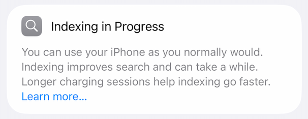
After iOS 27 Developer Beta 1 was released, people on social media began sharing screenshots of a new Settings message and asking the same question:
“Is this stuck?”
That reaction tells you everything about the design problem.
For years, users have been told to "give it a few days" after a major software update while Spotlight, Photos, and other system services rebuild their indexes. iOS 27 finally acknowledges that process with a visible status message in Settings — and that's genuinely welcome. But the new message surfaces a new problem.
The issue isn't that indexing takes a long time. The issue is uncertainty. The current interface gives users no way to tell if it's working normally or slowly, temporarily paused, or stuck
That's a challenge for both technical and non-technical users. Most people just want reassurance that nothing is broken. Technical users want a different but equally reasonable answer: is it actually doing anything?
Good design serves both.
What Could Apple Do?
None of these concepts require exposing technical implementation details. Their purpose is to reduce uncertainty.
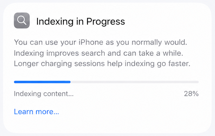
Progress Bar Concept
The simplest solution is often the best one. A traditional progress bar communicates exactly what most users want to know: is progress being made, and roughly how much work remains?
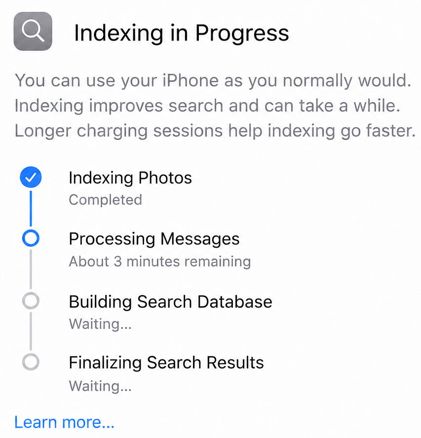
Task-Based Concept
Rather than showing a percentage, it shows activity — what the device is currently doing and which tasks remain. The interface feels like a status report, making the process feel alive rather than frozen. For users who want to understand what's happening without needing to understand how it works, this is a more meaningful view than a single number.
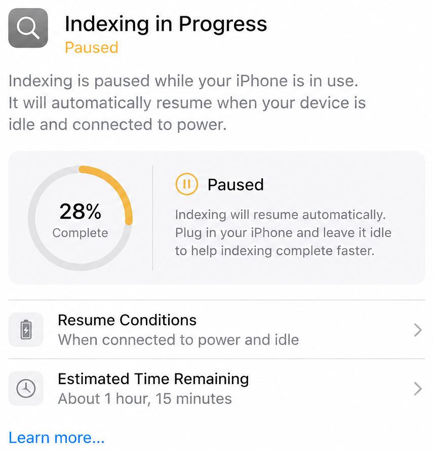
Paused Concept
Some background processes intentionally pause while a device is in active use. That's usually the right tradeoff — most users would rather have a responsive iPhone than one that finishes indexing ten minutes sooner. But the problem isn't that the process pauses. The problem is that users aren't told it has paused.
A paused state indicator would resolve this. If indexing is waiting for the device to be idle, say so. Users don't need every implementation detail. But knowing why something appears stuck is often enough to turn frustration into patience.
Good Design Reduces Uncertainty
There's a common misconception that simplicity means hiding information. Apple's best products demonstrate the opposite: great design reveals the right information at the right time. Non-technical users get reassurance that everything is working normally. Technical users get insight into what's affecting progress. Both groups walk away with the same thing — confidence that the system is behaving as expected.
Apple's new indexing message is a step in the right direction. It acknowledges a process that has existed for years but remained largely invisible. The next step is better information. When users can't tell whether something is working, they naturally assume it's broken.
And yes... of course I filed feedback.